PARTNERRE
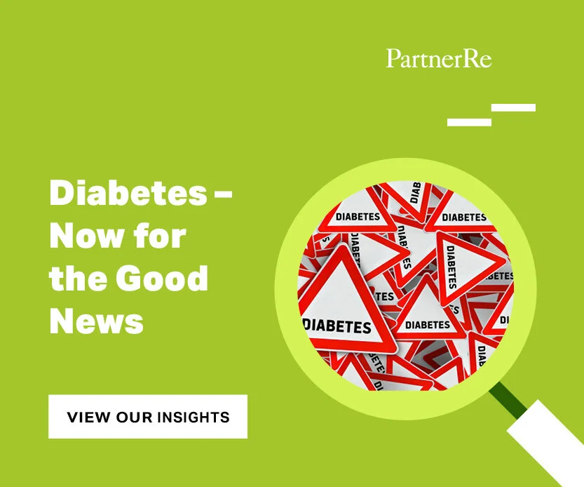
PartnerRe is an international insurance and reinsurance business that was looking to stand out with a colorful, fun, and dynamic style. The company needed a brand alignment across its marketing system.
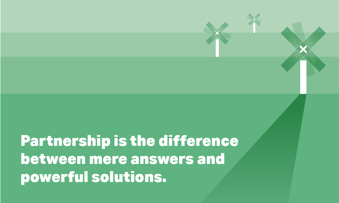
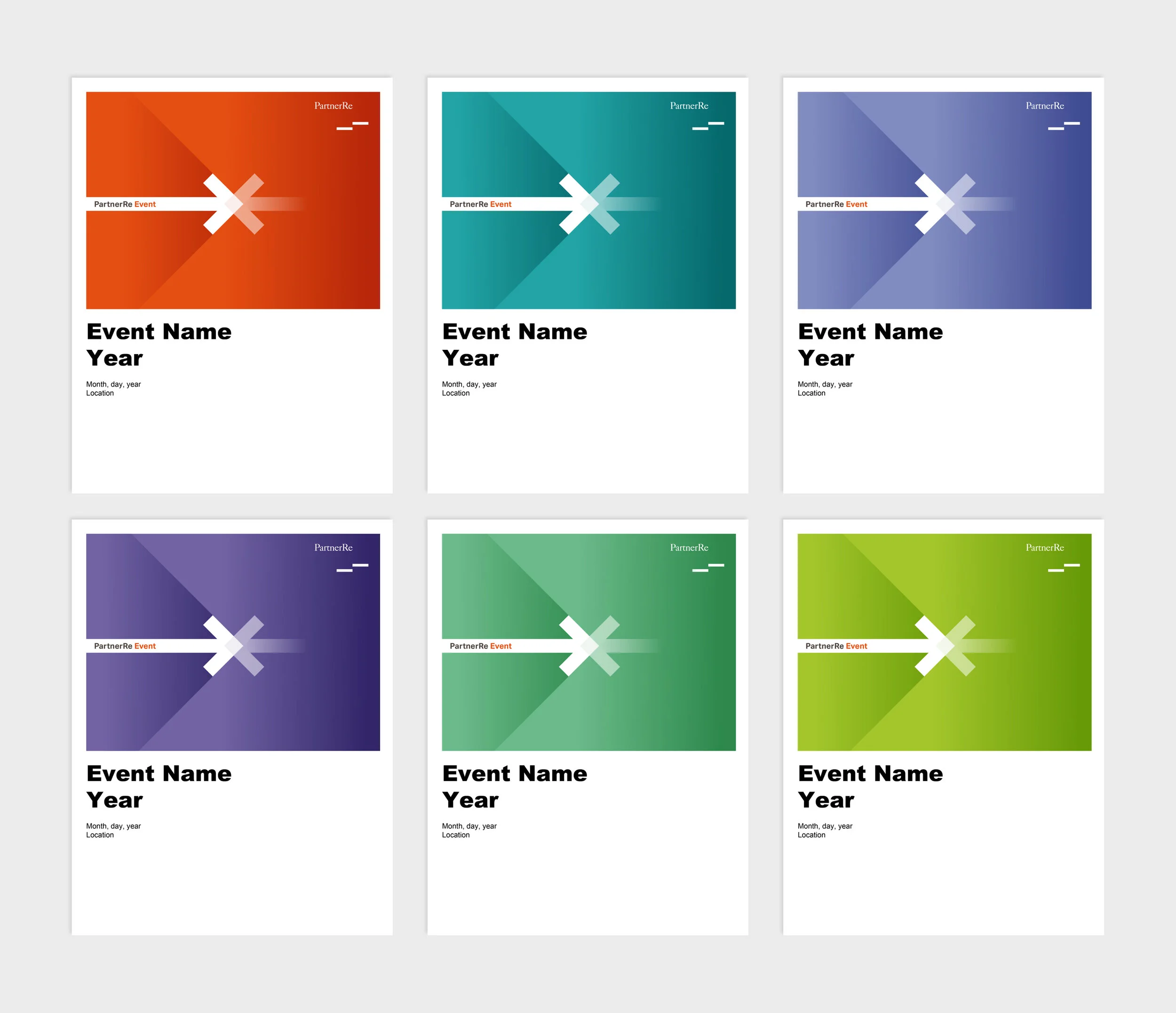
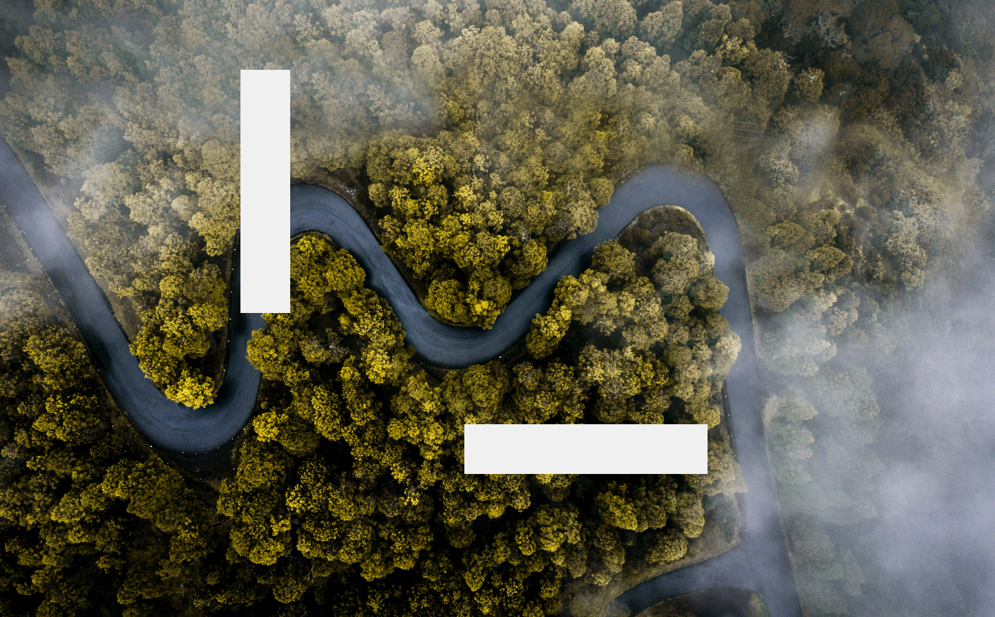
As part of the Agenda team, we decided to incorporate six modern colors to the brand palette and developed a simple and unique illustration style. The main aspect of the illustration style is based on simple shapes having a white bar element always as a representation of their logo.
Work
Branding / Print / Website / UX / UI / Illustration / Art Direction / Creative Direction
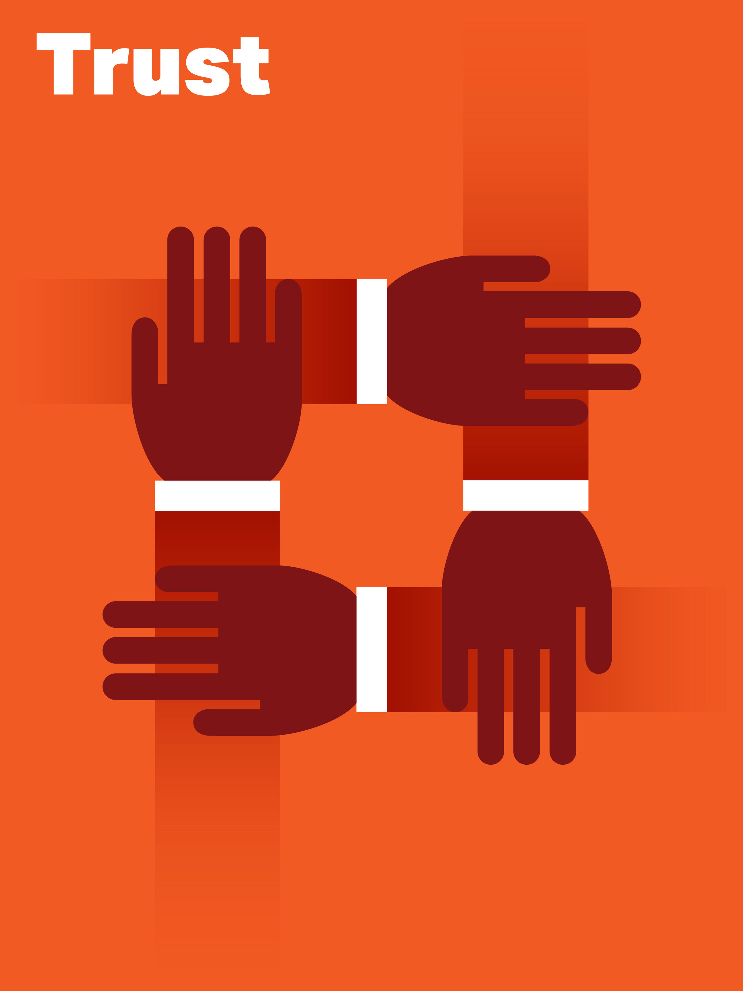
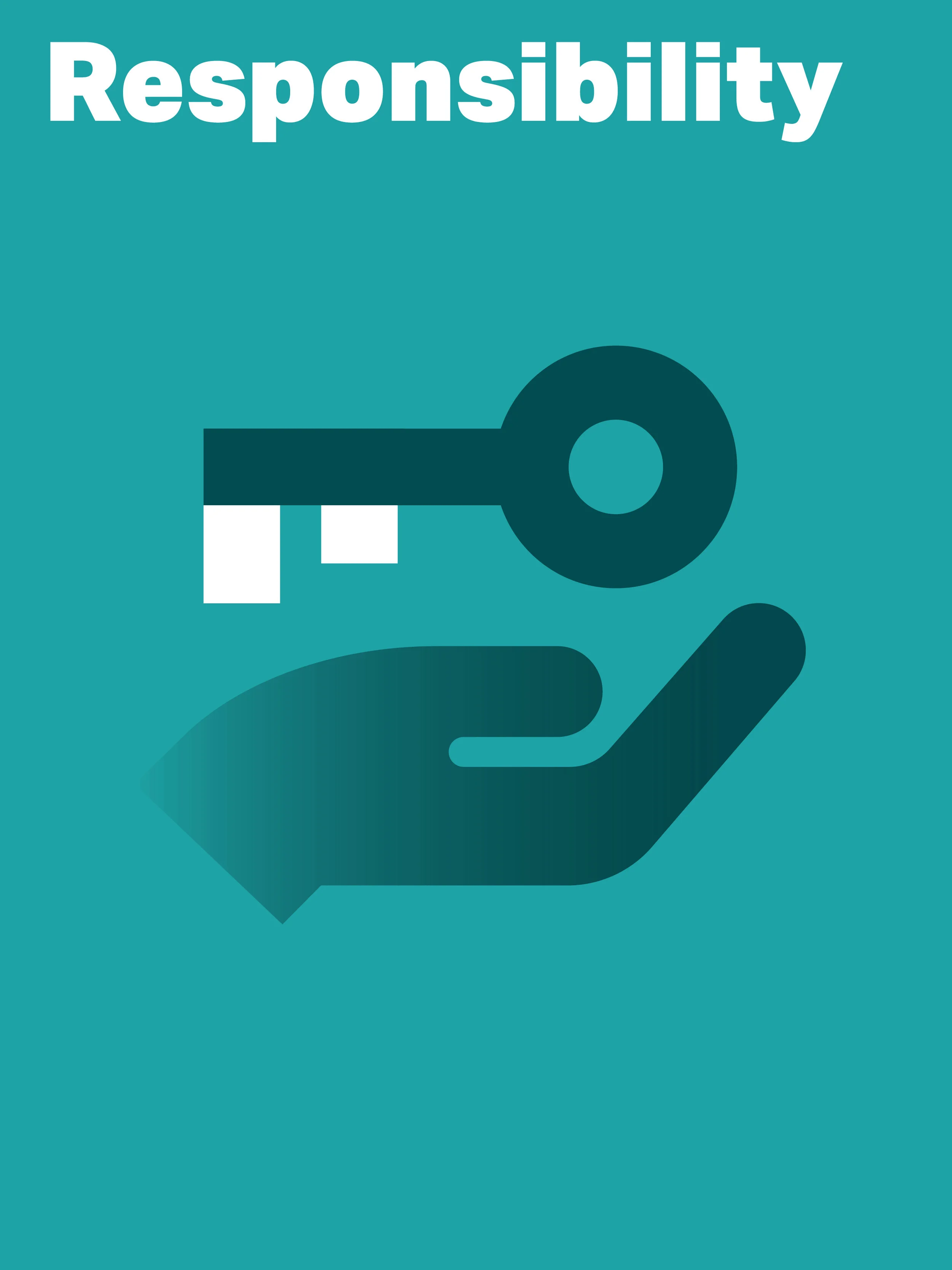
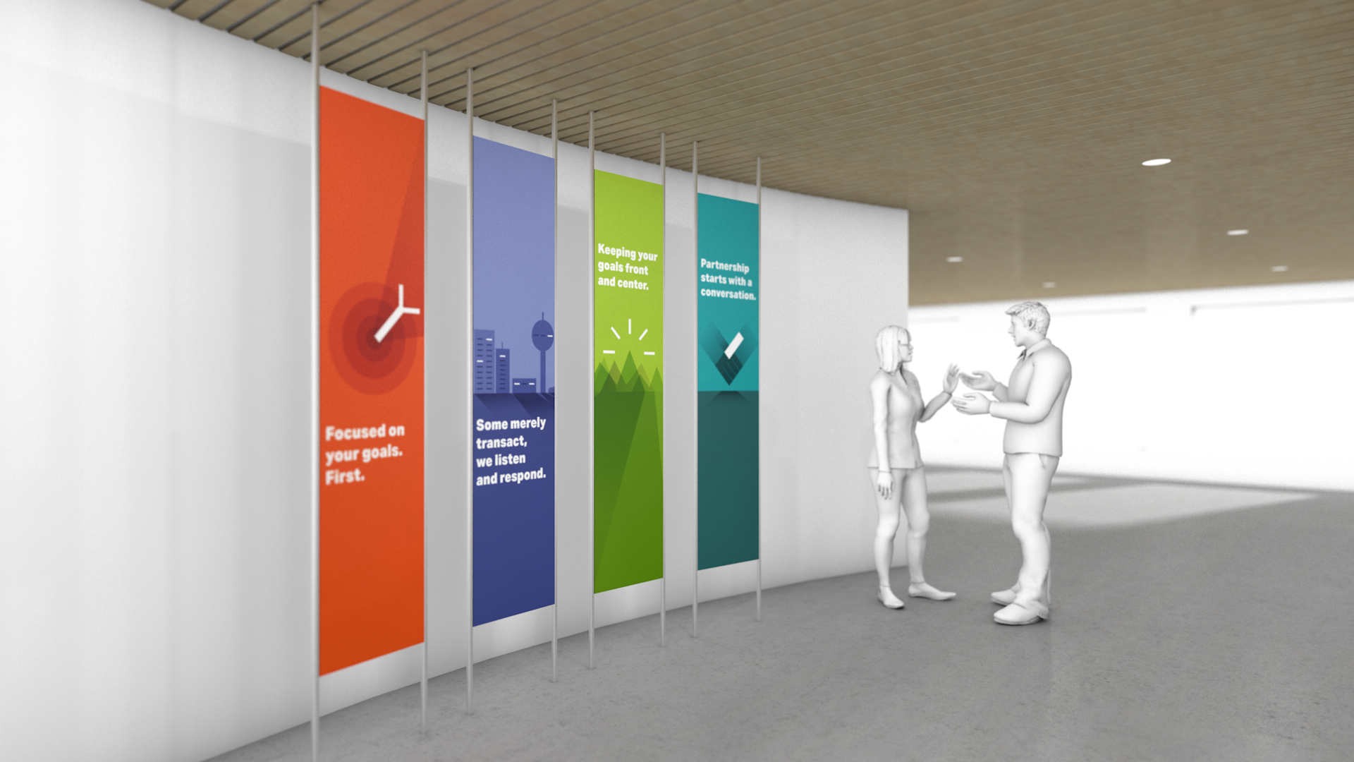
VALUE ILLUSTRATIONS
One of the most important aspect of a brand are its values and I was responsible of the concept and design of PartnerRe Values.
Sub-brand logos
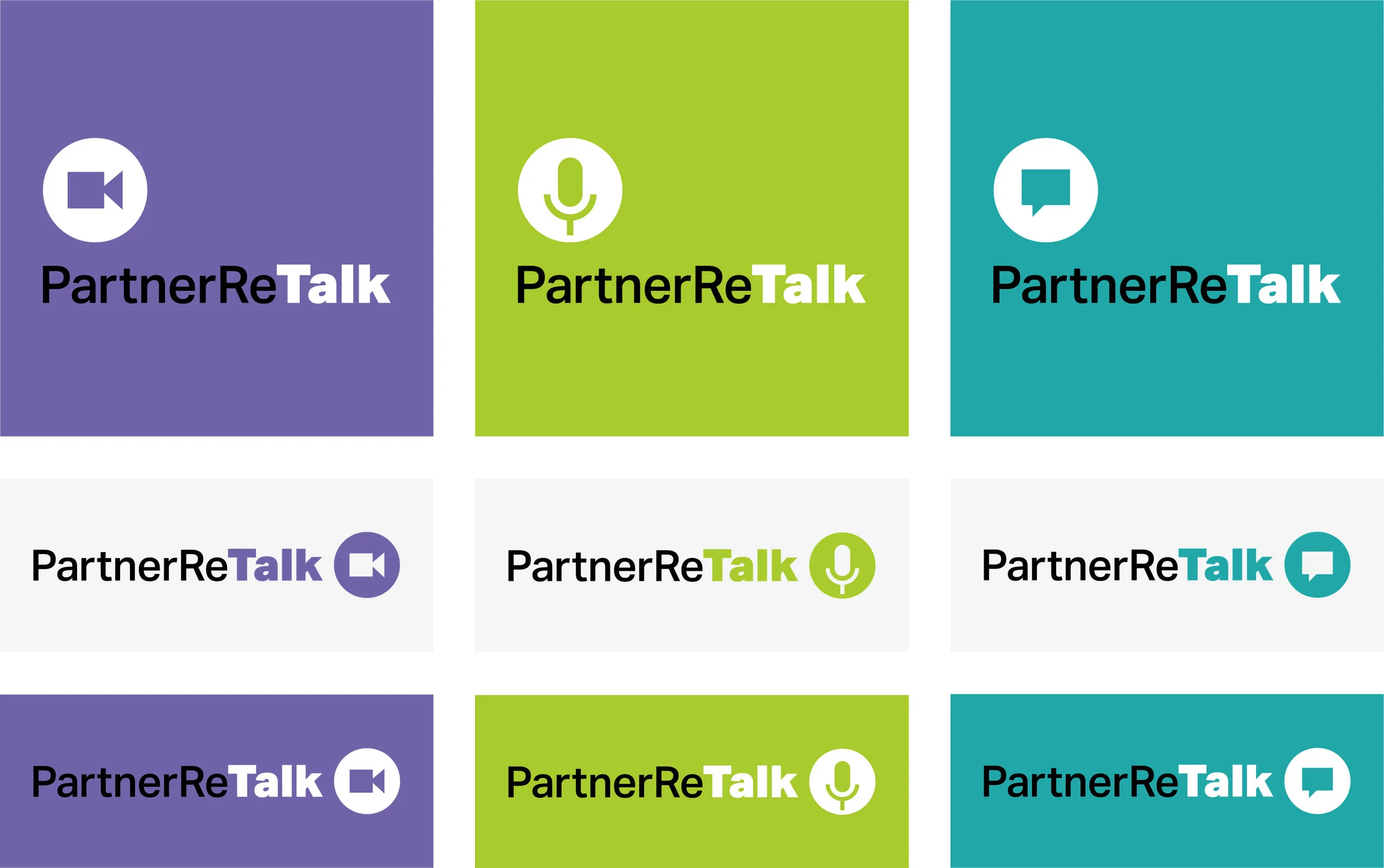
I designed logos for sub brands inside the big brand Umbrella. Brands that go from Video platforms to Event logos.
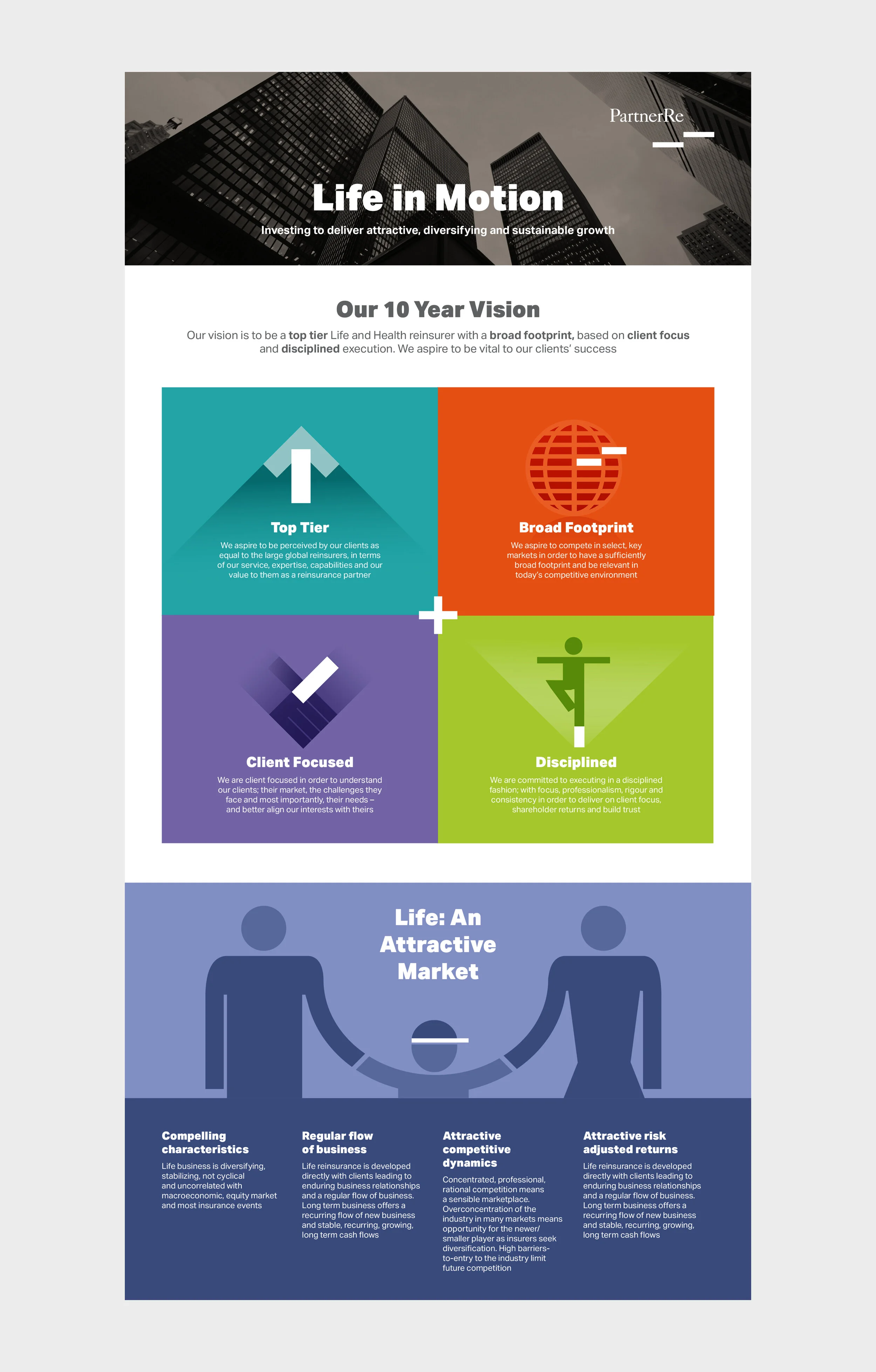
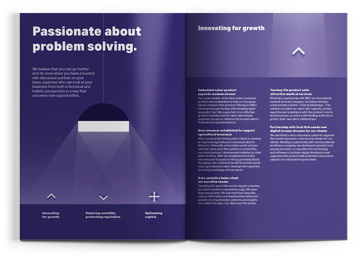
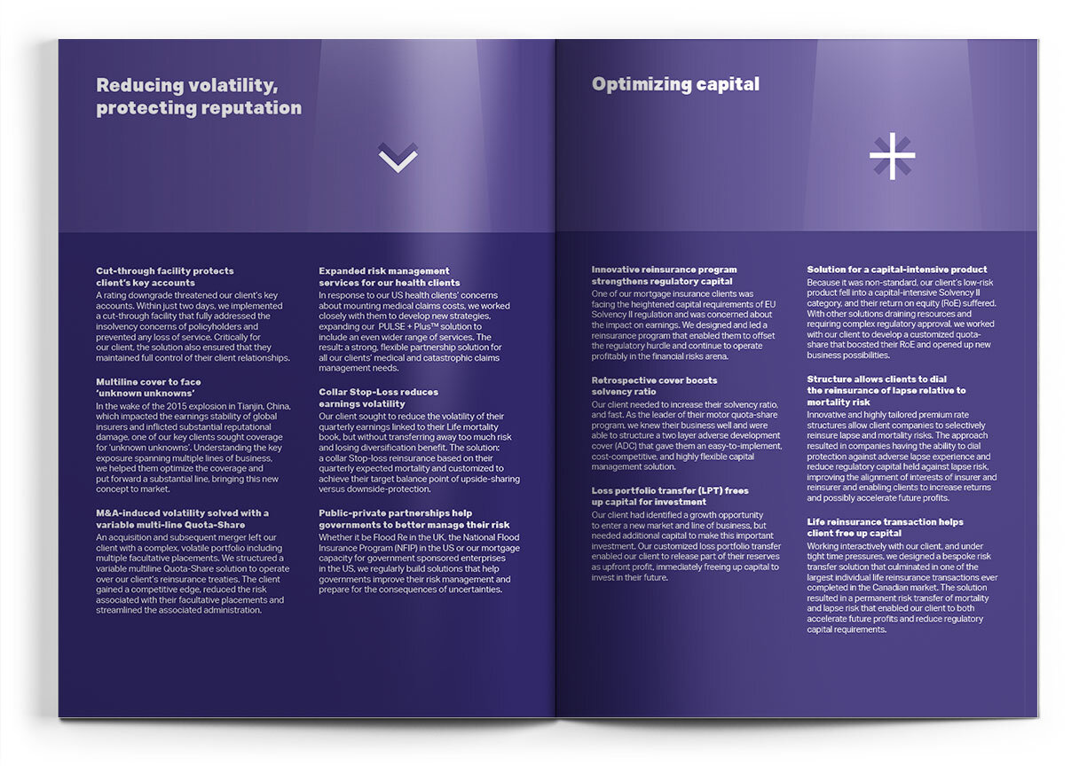
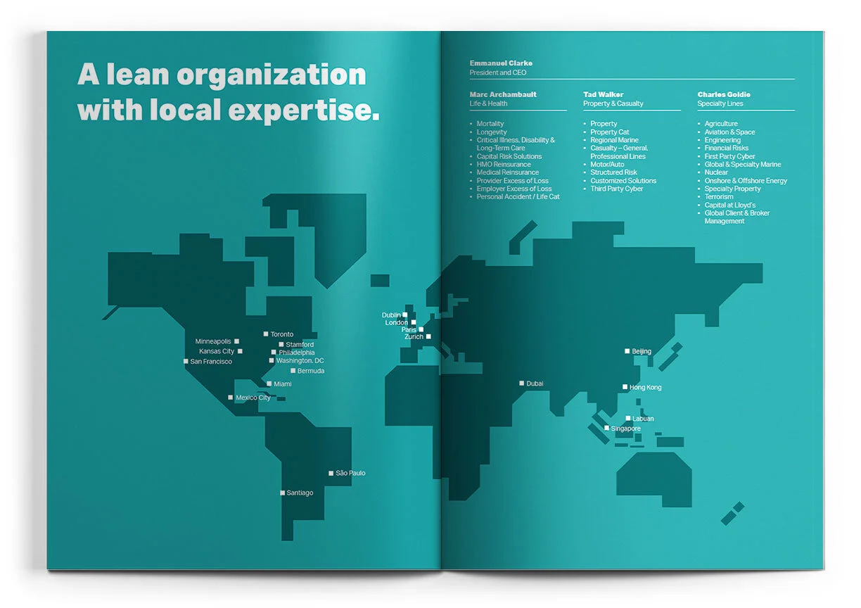
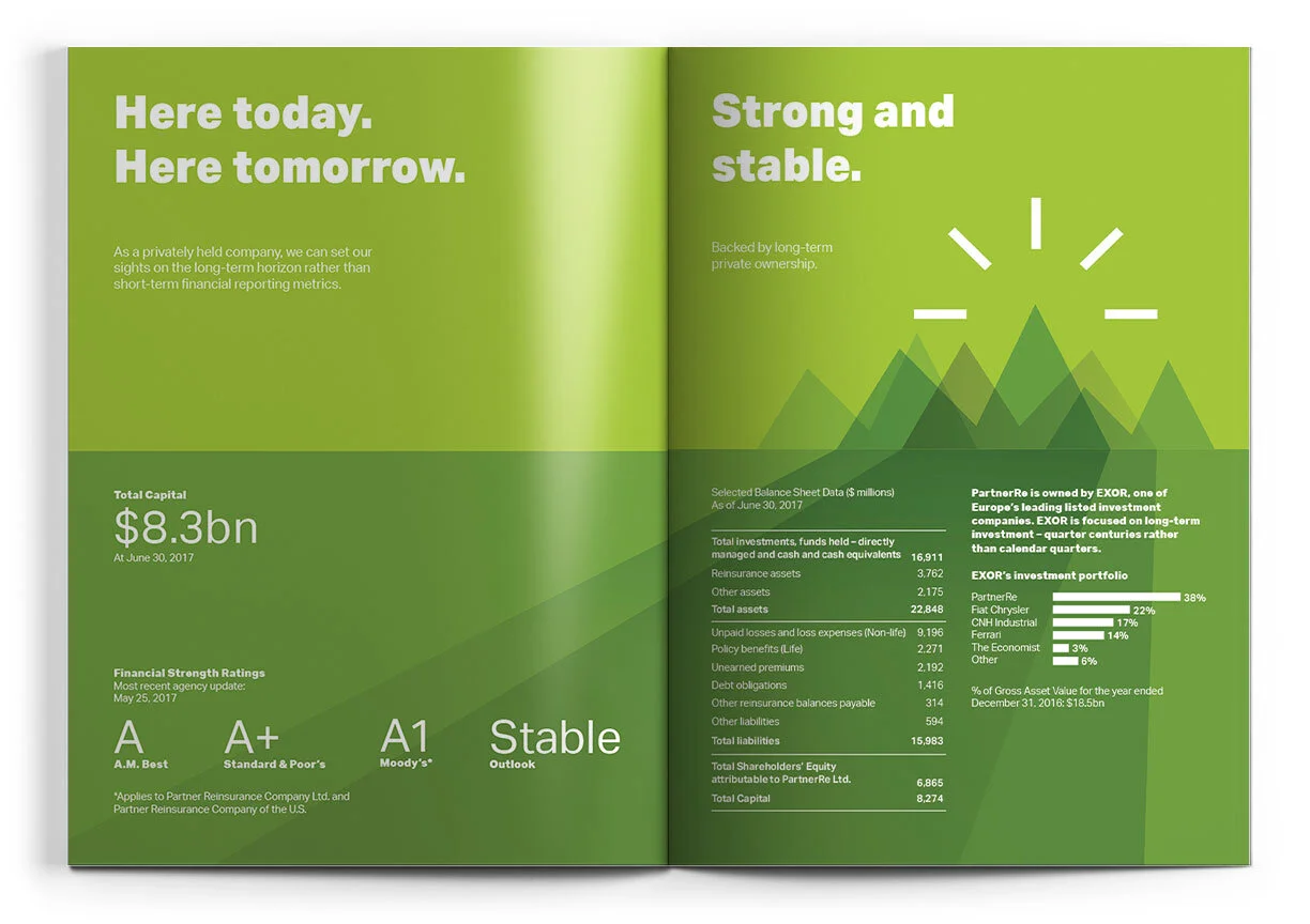
corporate bruchure
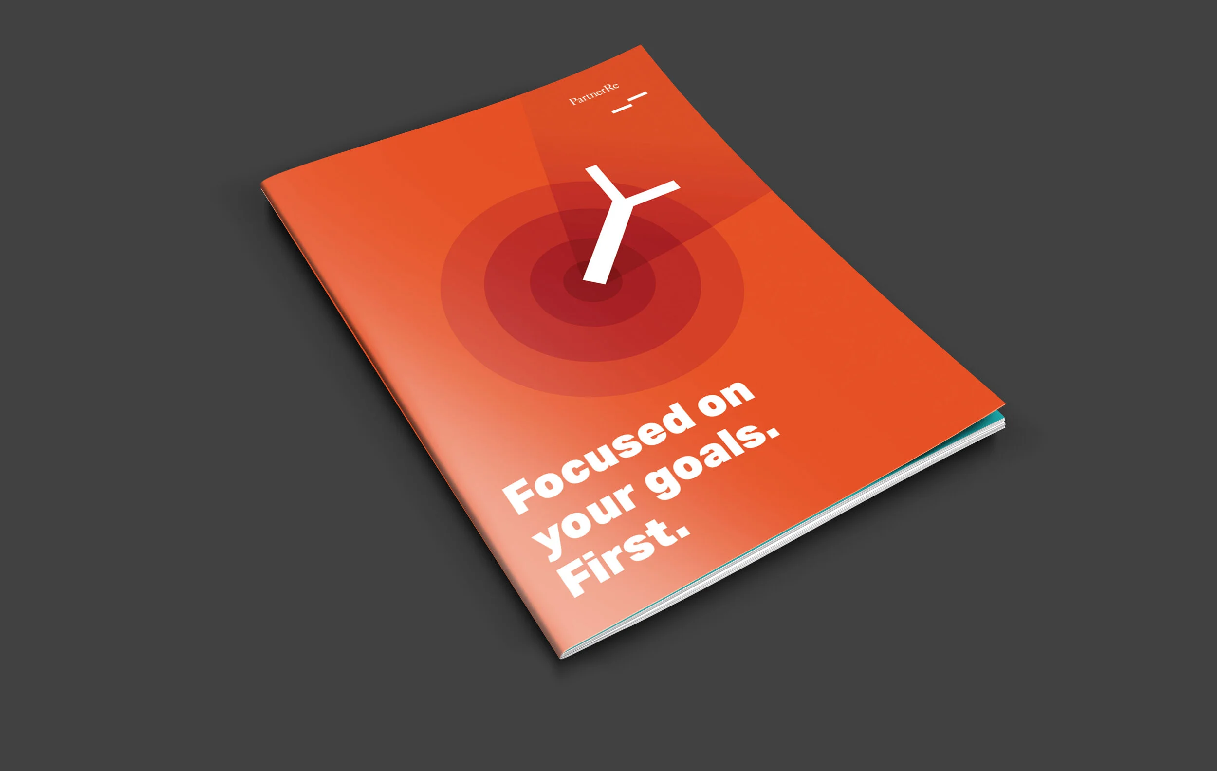
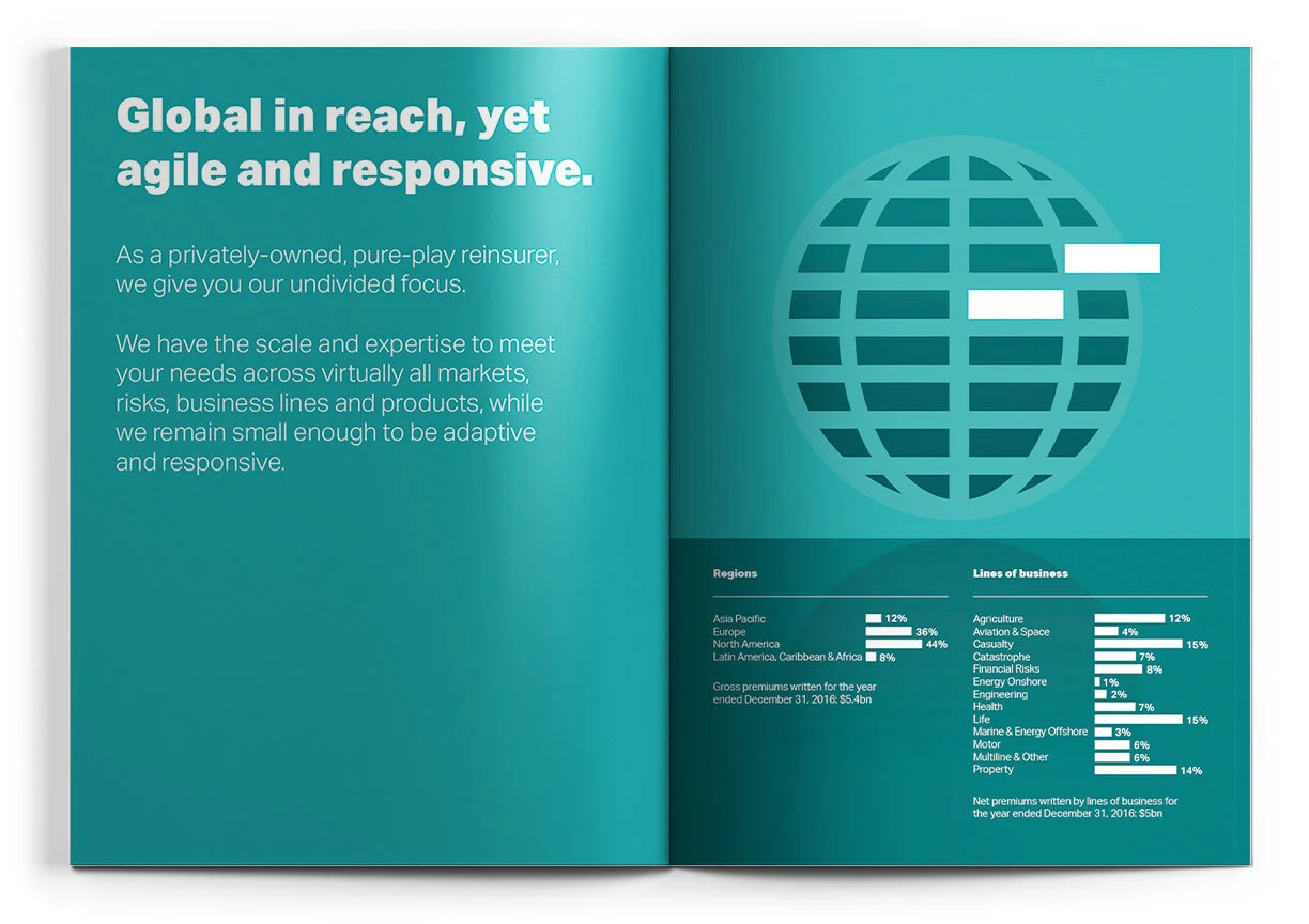
Design of PartnerRe’s Corporate brochure for digital and print uses. A Brochure with illustrations and big titles to make the content easier to digest.
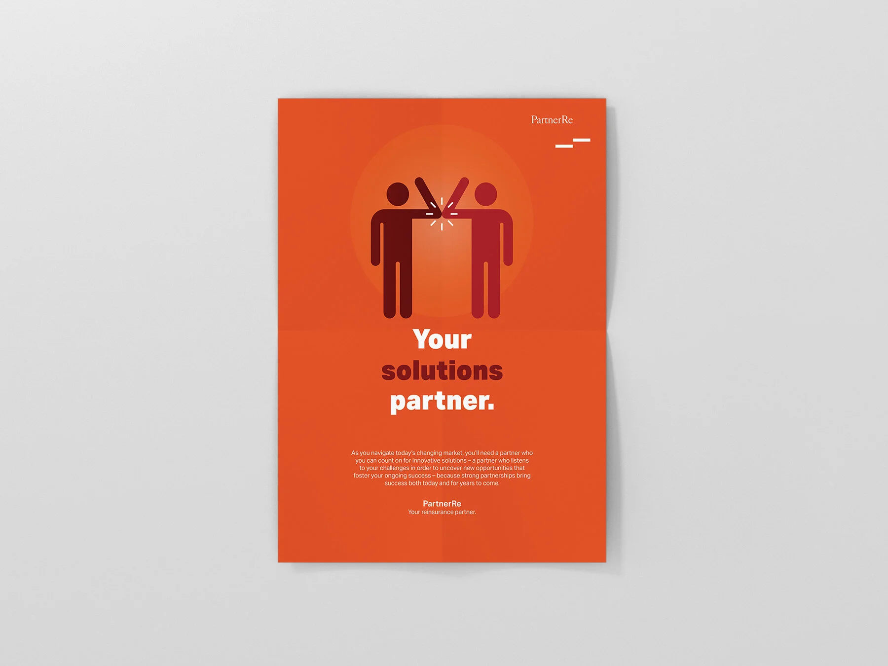
COVID-19 POSTER
The Pandemic of 2020 was impacting the way PartnerRe was communicating their idea of partnership.
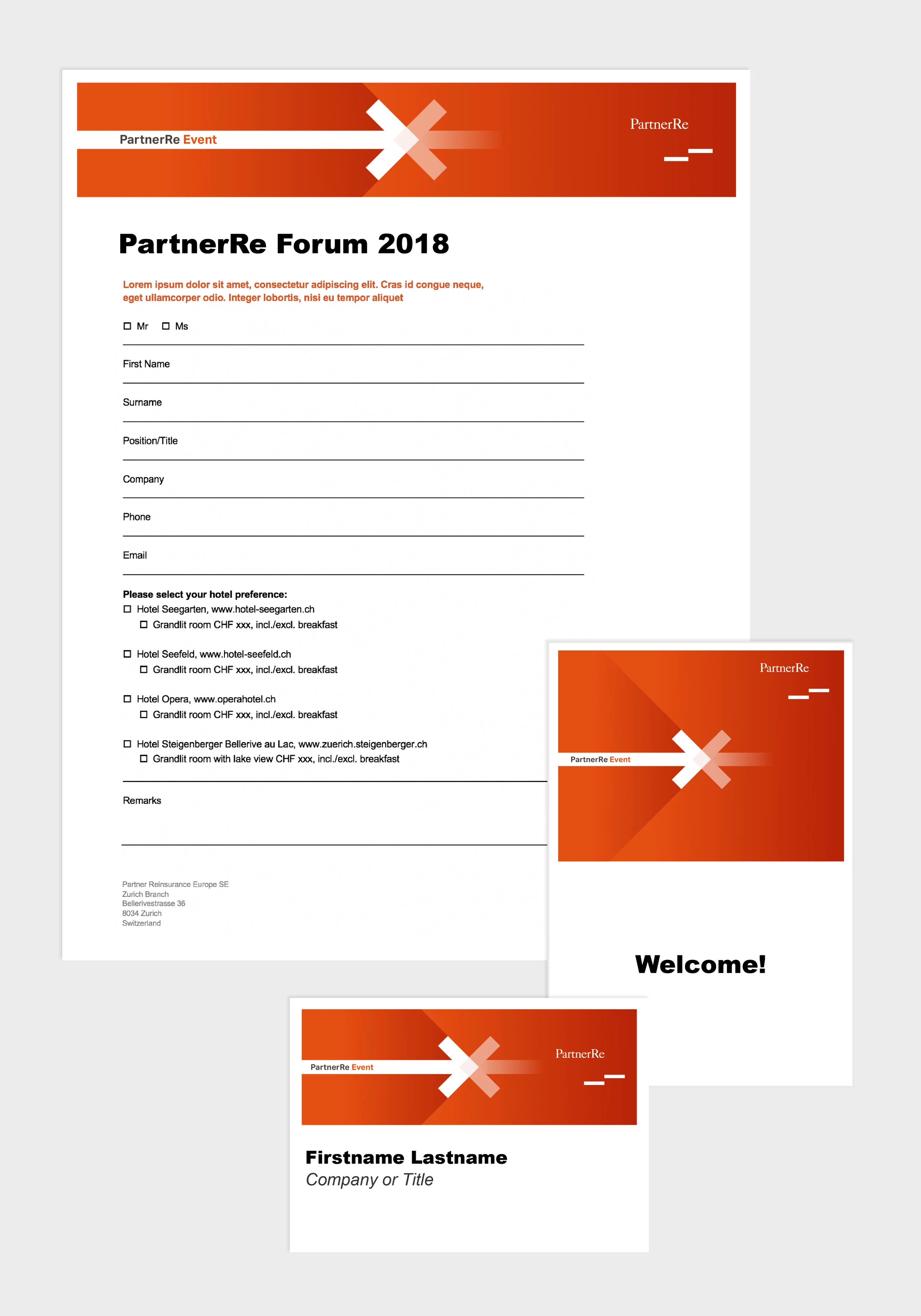
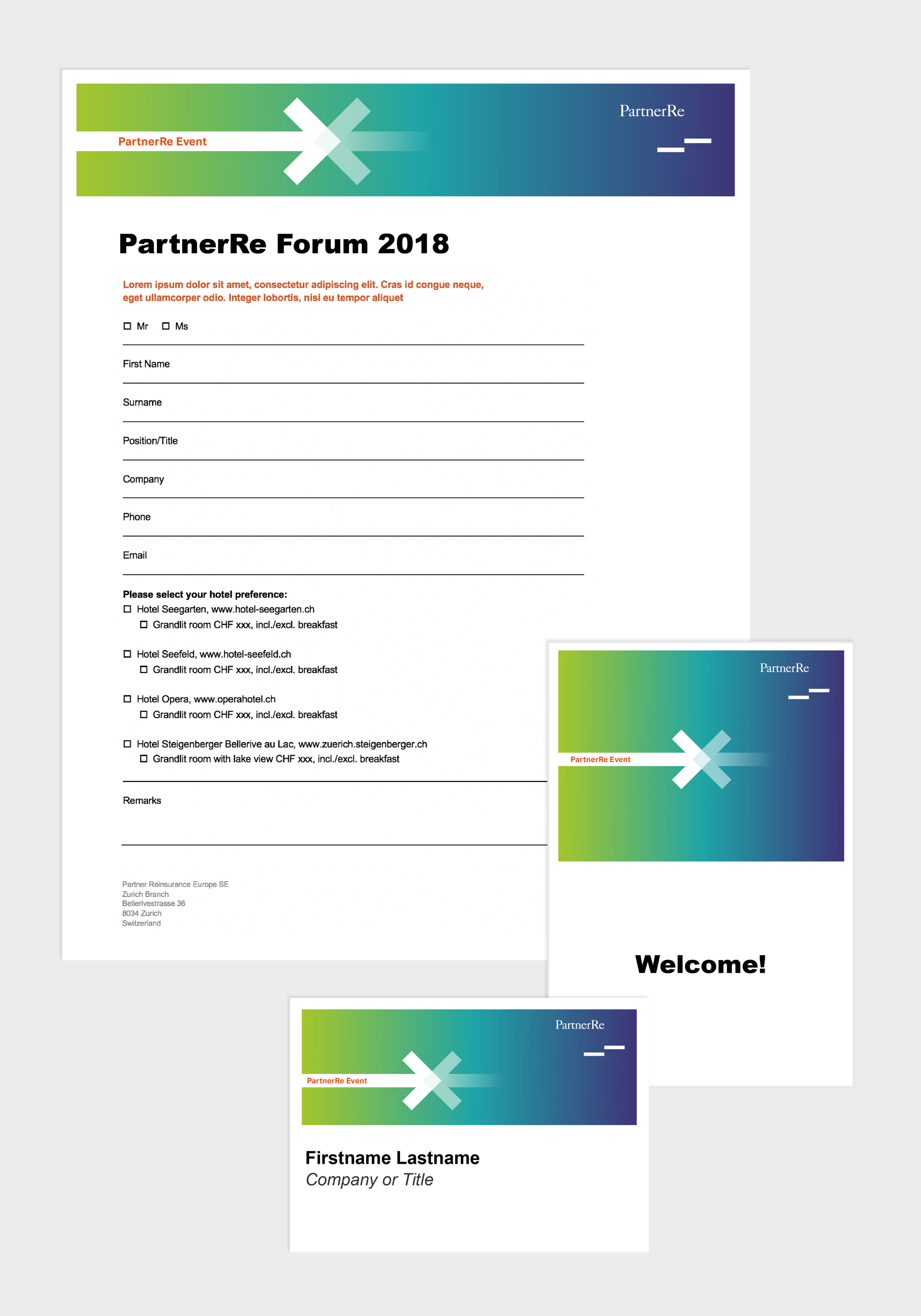
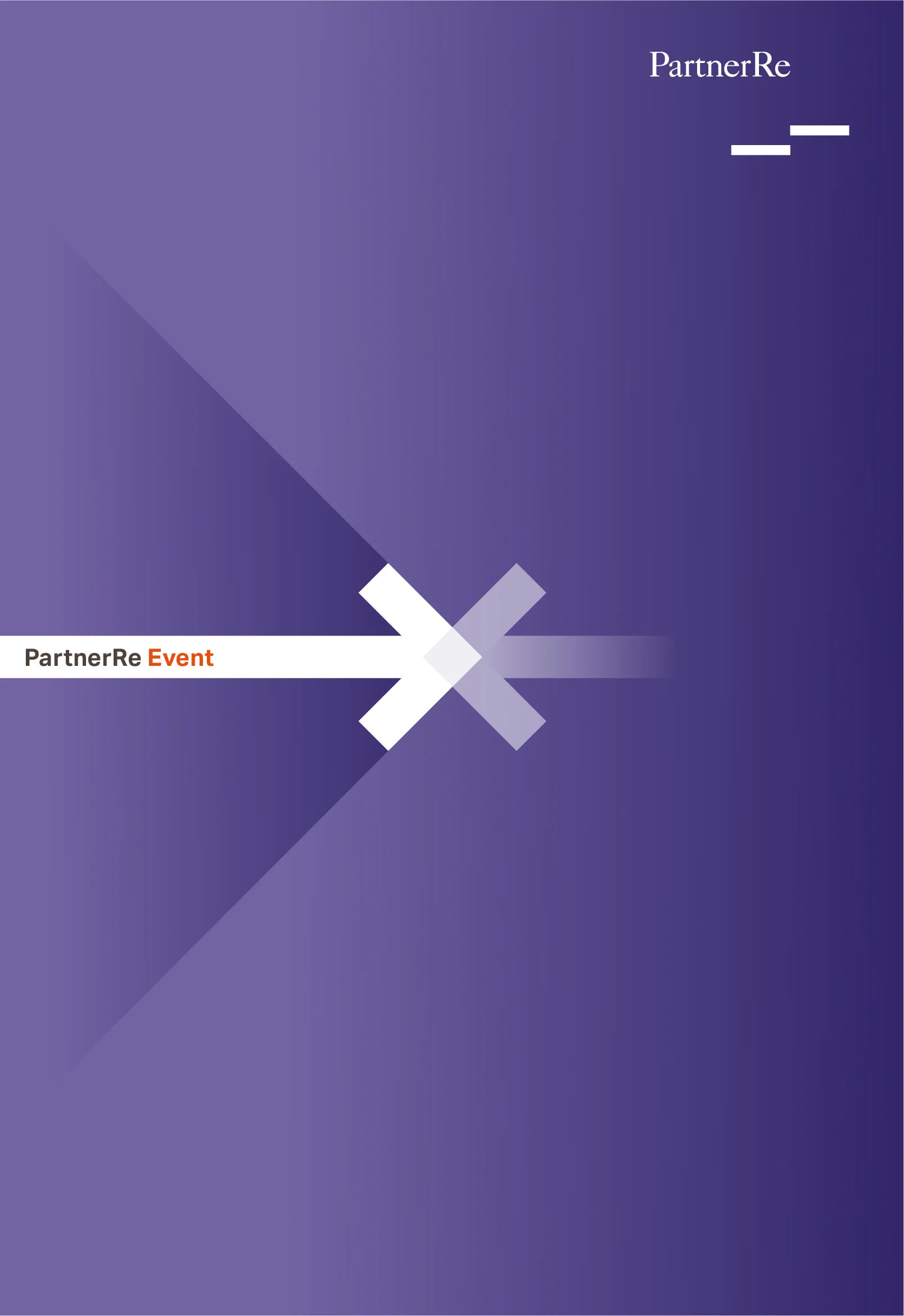
partnerre event
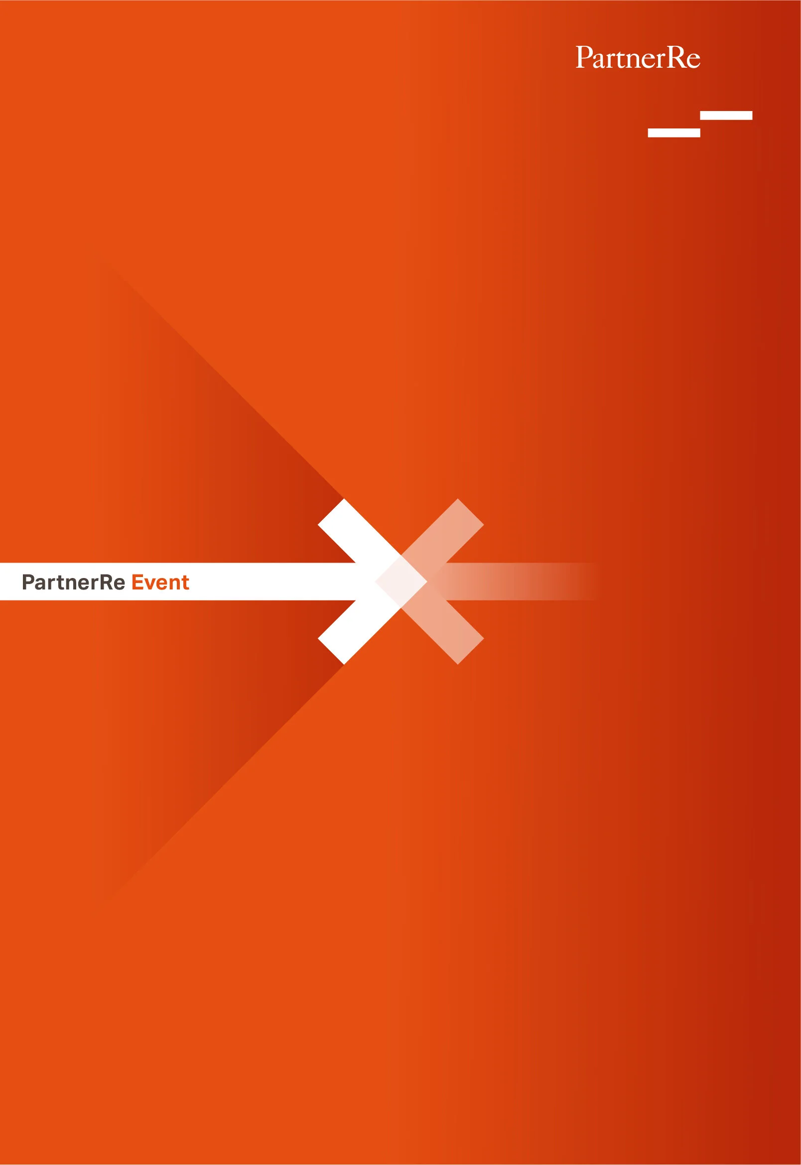
PartnerRe asked Agenda to update their “PartnerRe Event” digital and print templates with a fresh and modern design. The main idea that I convey with this design is “Coming together”, “The exchange of ideas and insights. ”This design is evocative of a meeting place at a center point. The middle of something is where actions happens, where everyone wants to be, where collaboration happens. We see it as an intersection of people coming together in a center point to share their knowledge and learn from one another. In this motif, diverse ideas are being exchanged, represented by the shape and the colors.
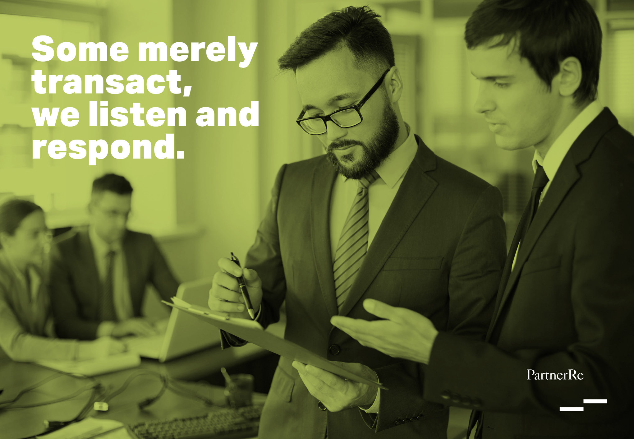
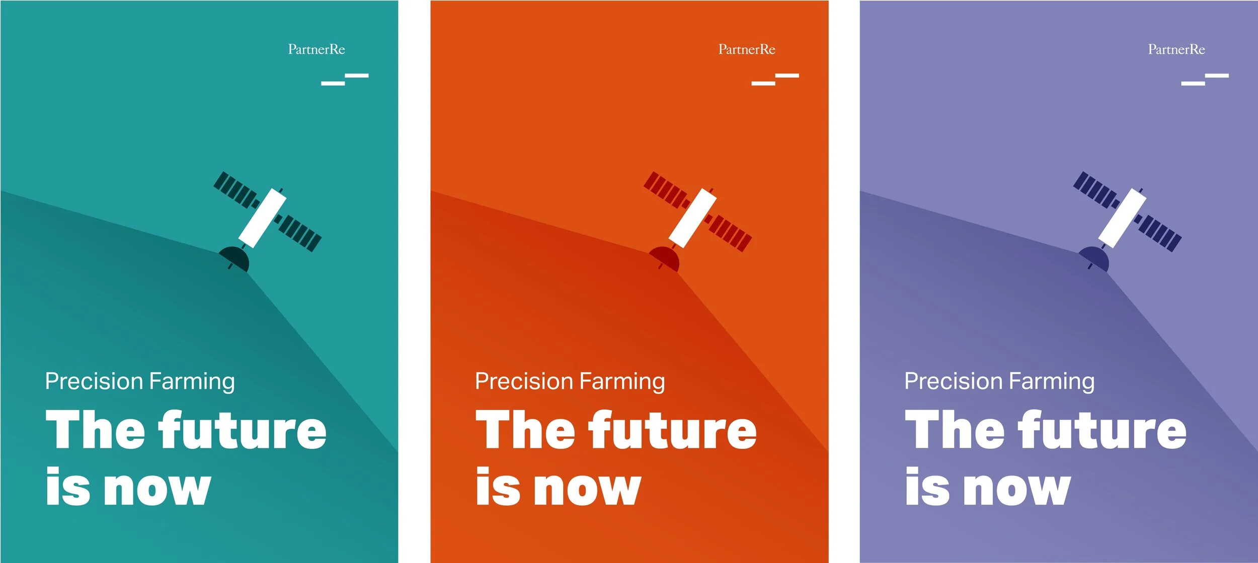
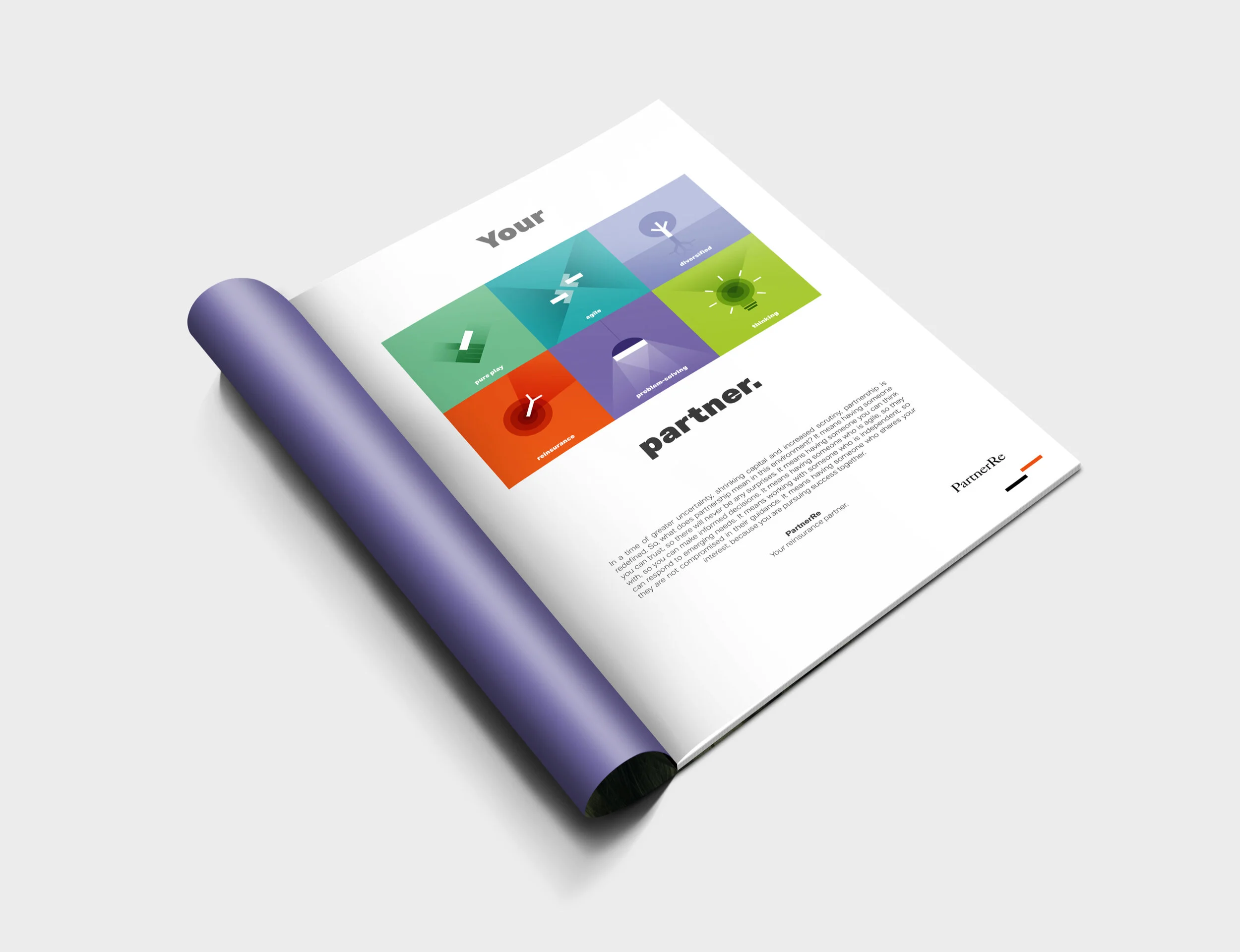
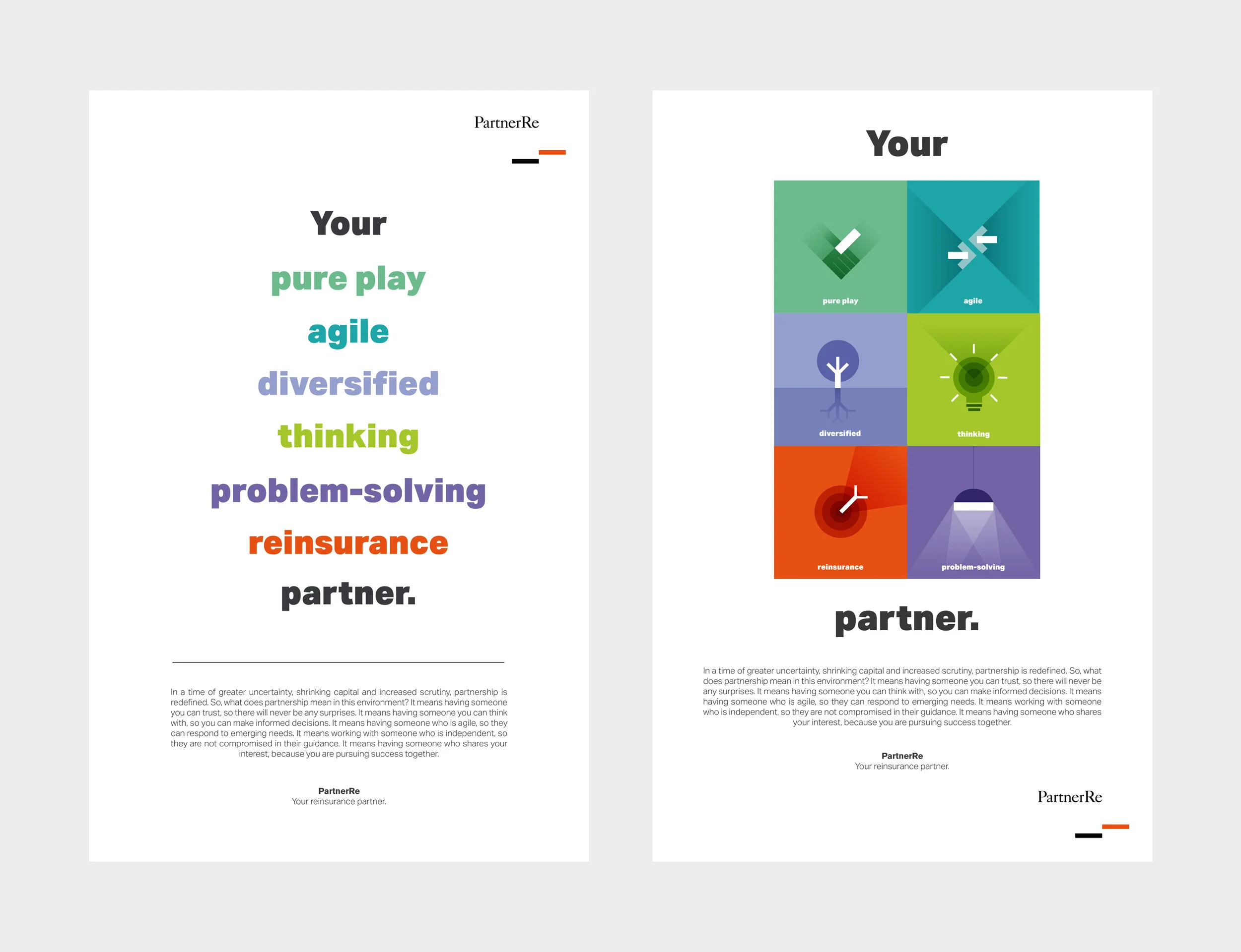
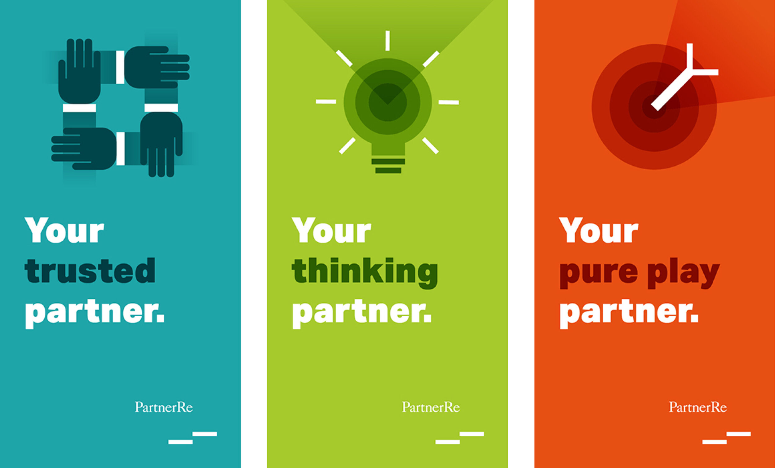
Your ___ partner campaign
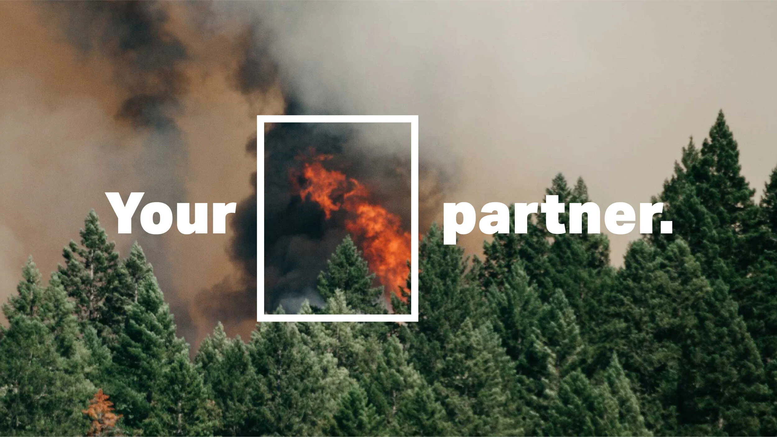
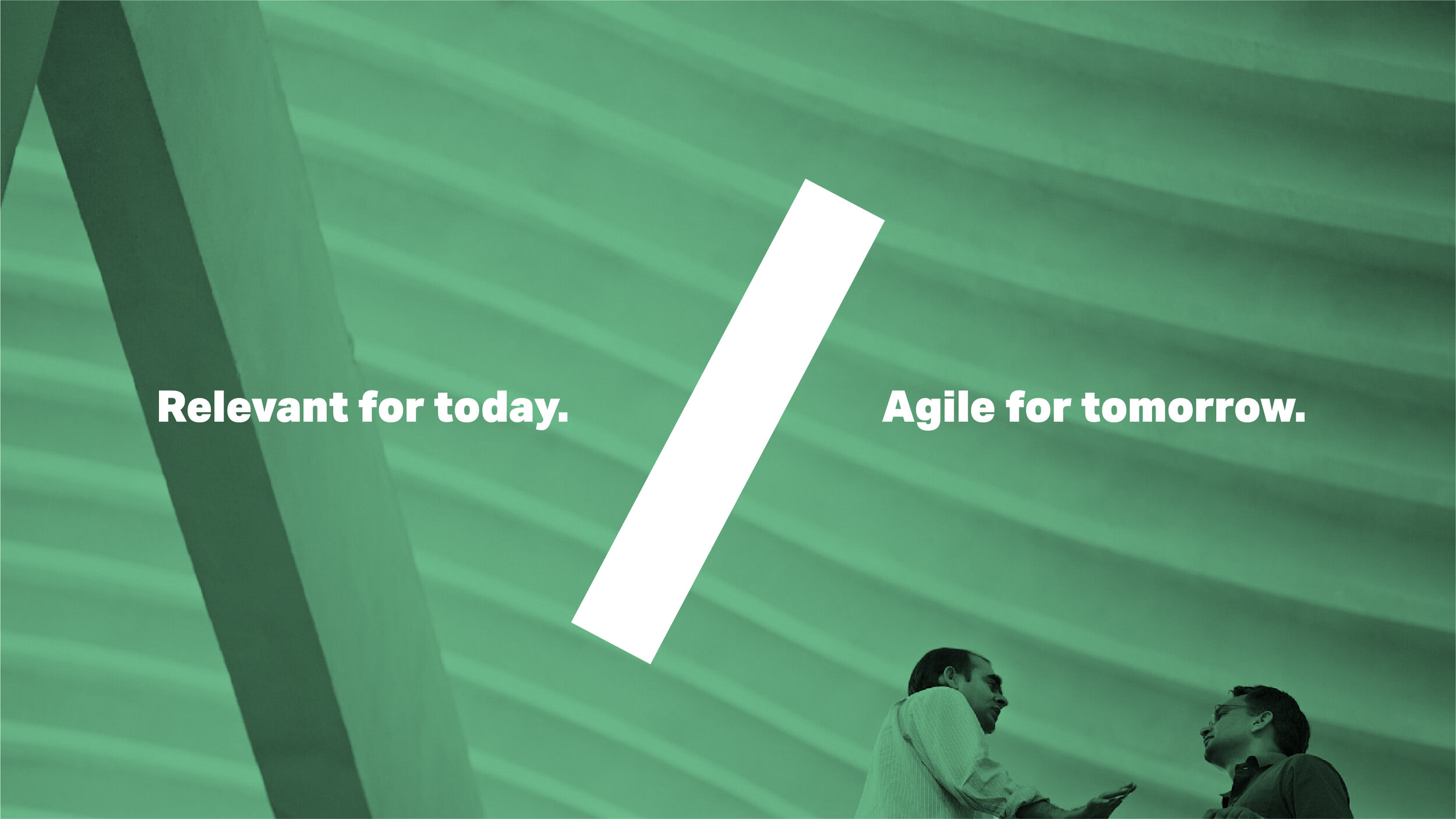
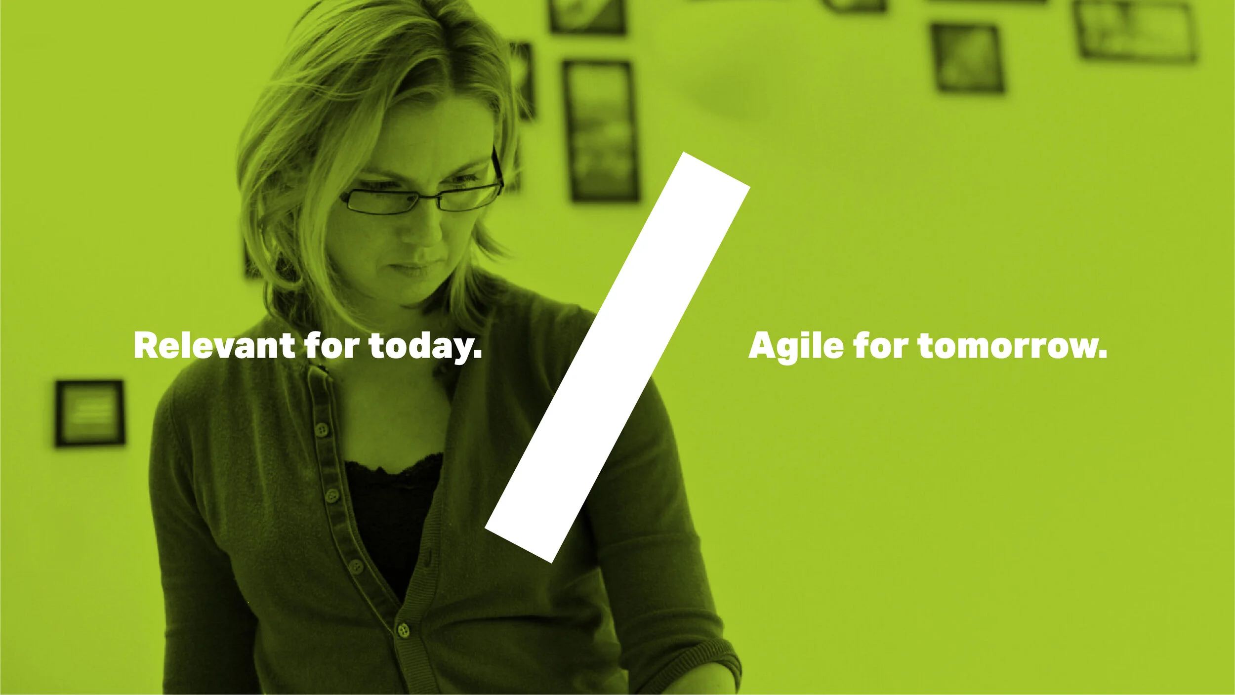
We were originally asked to refresh PartnerRe’s campaign and elevate PartnerRe’s content, with a focus on the people, research and products/lines of business.
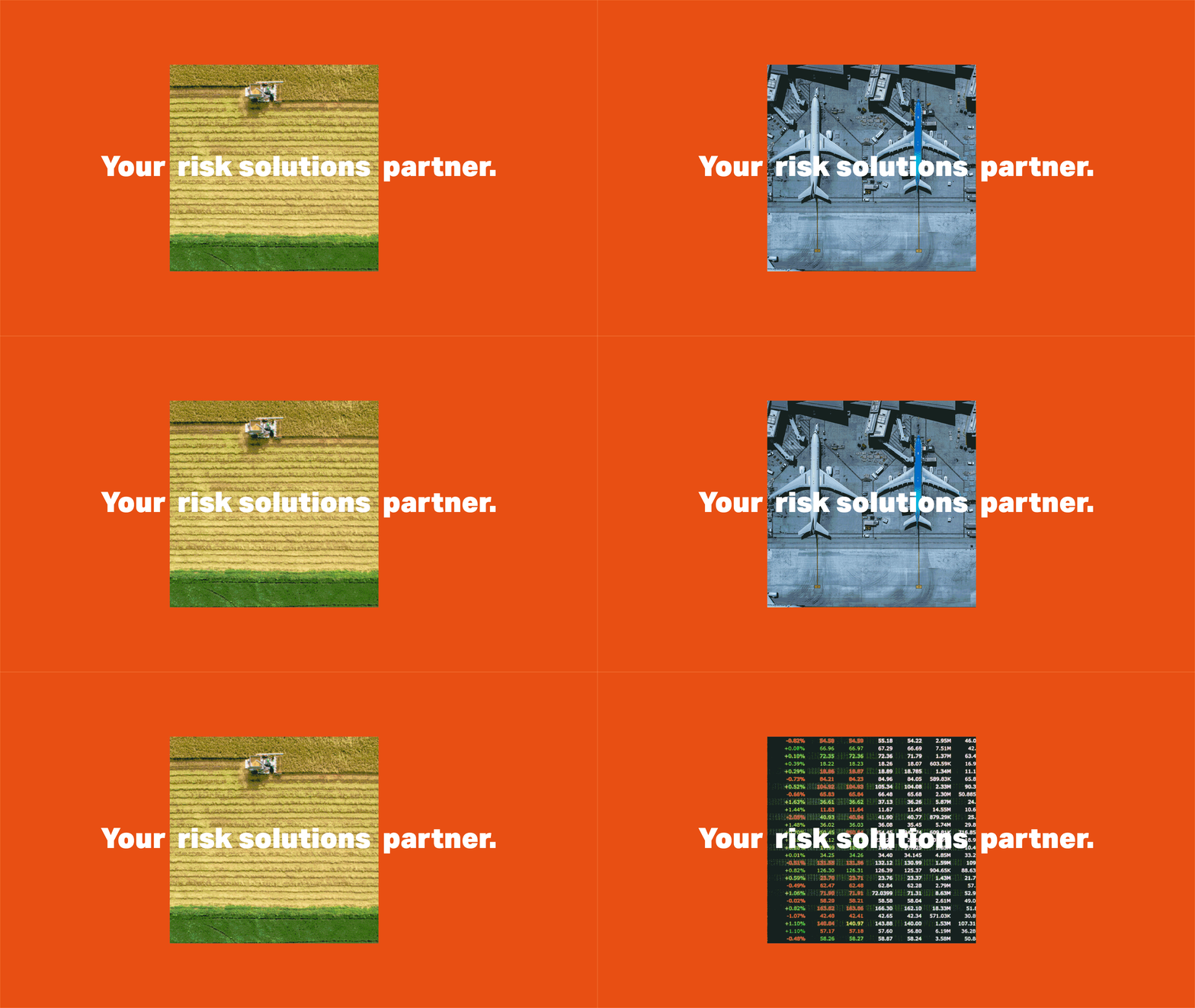
We oriented the first around partnership using a simple visual/text device that would support both the brand and the content we are bringing to the surface.
This format is highly flexible and scalable, and we can apply it to as many cases as we can conceive of.
web design
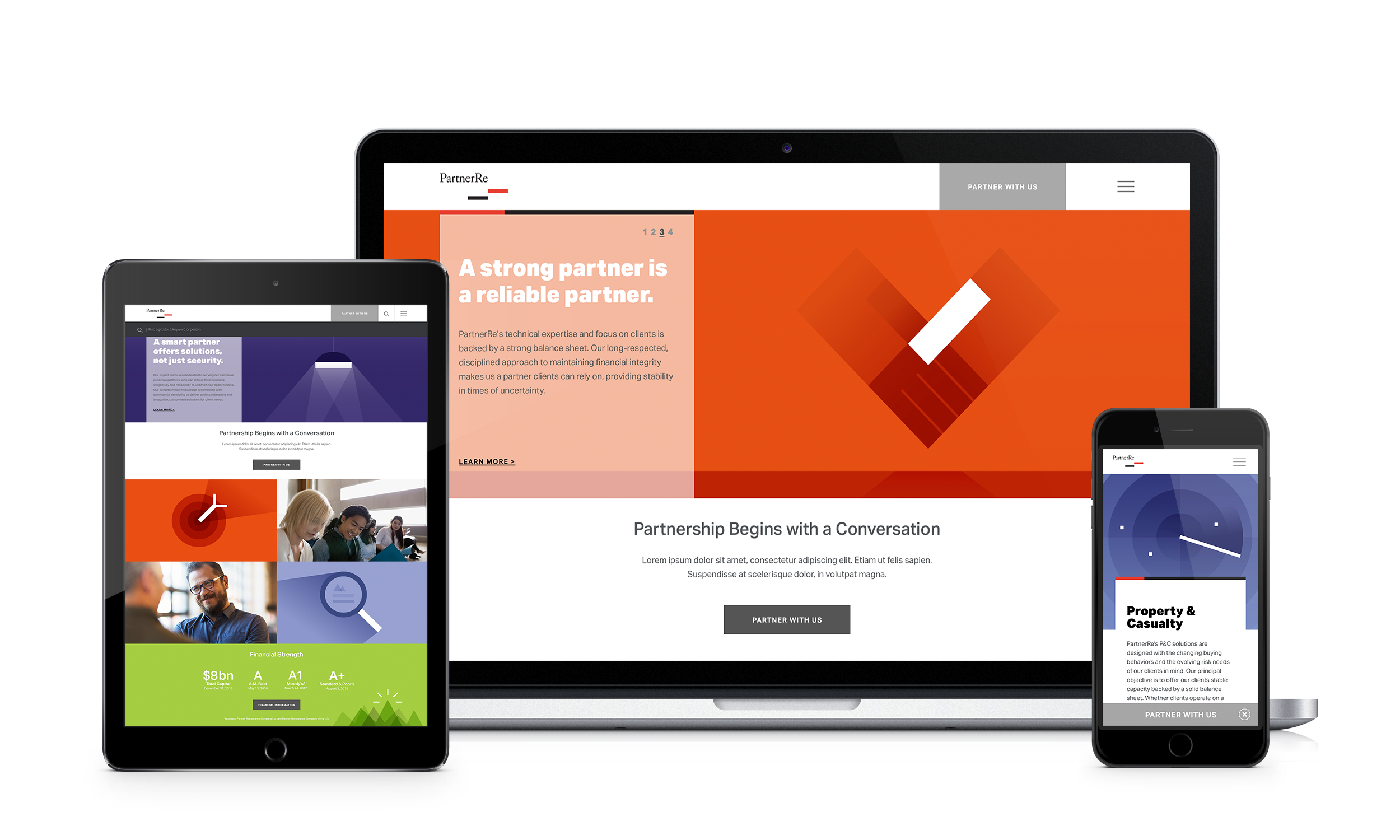
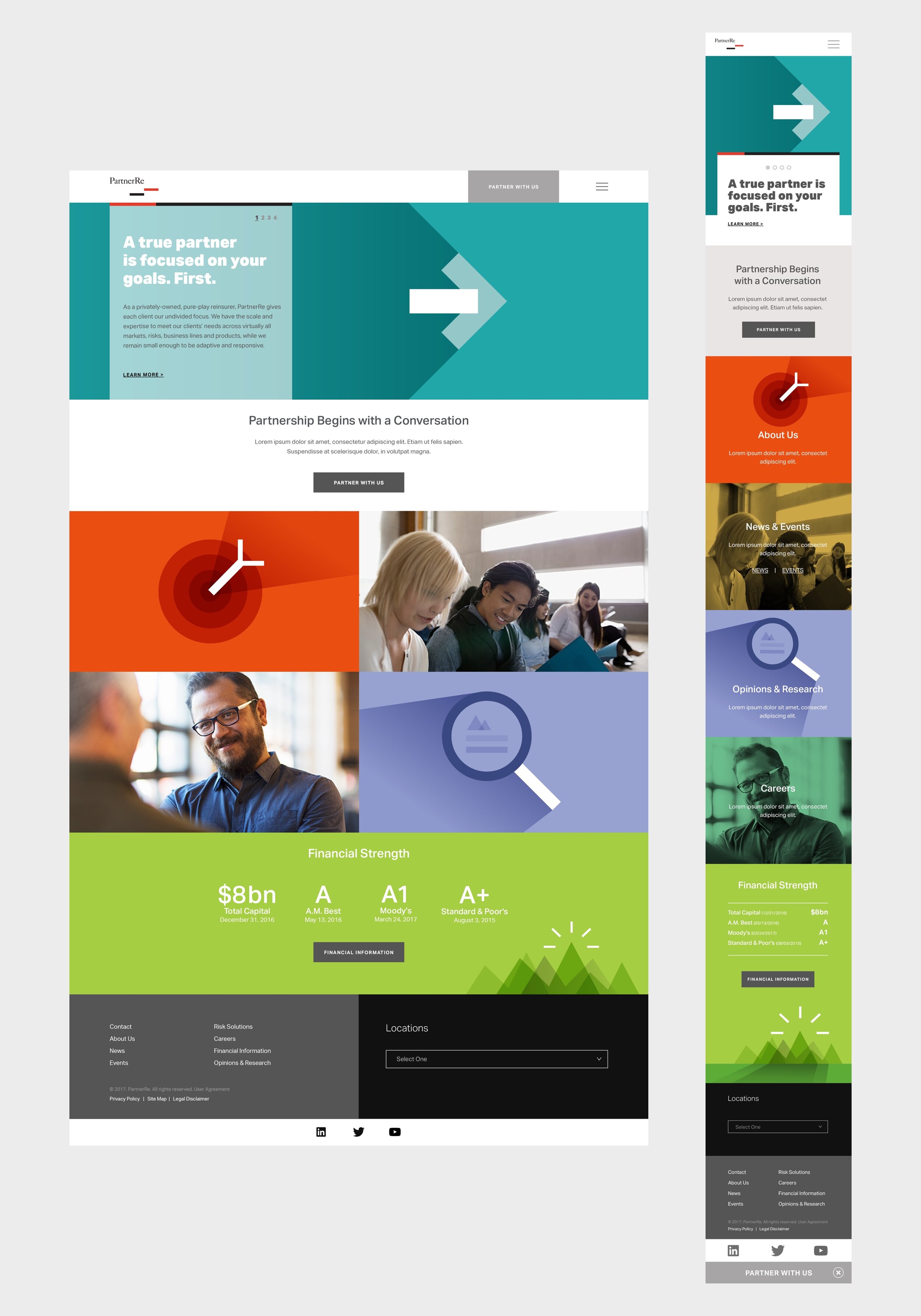
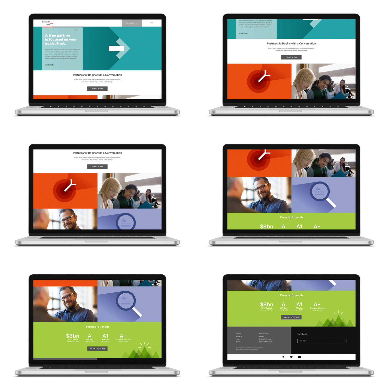
Maintaining the same look and feel, I was part of the design team responsible to redesign the PartnerRe website, including the creation of new illustrations.
holiday card
I designed the holiday card for the company. The main ask was to avoid a Christmas look but to emphasize the feeling of joy and celebration.
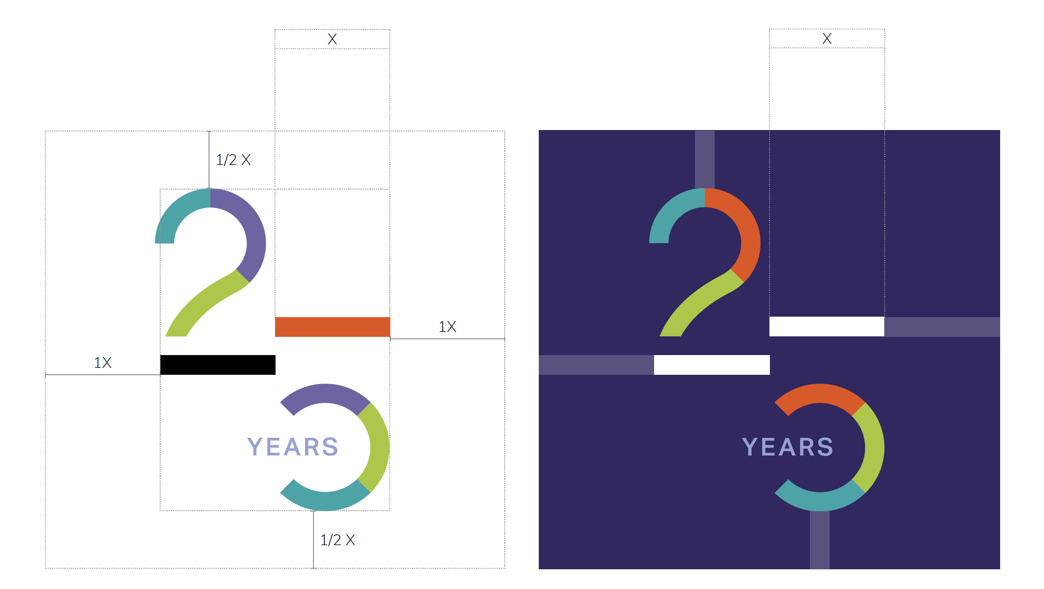
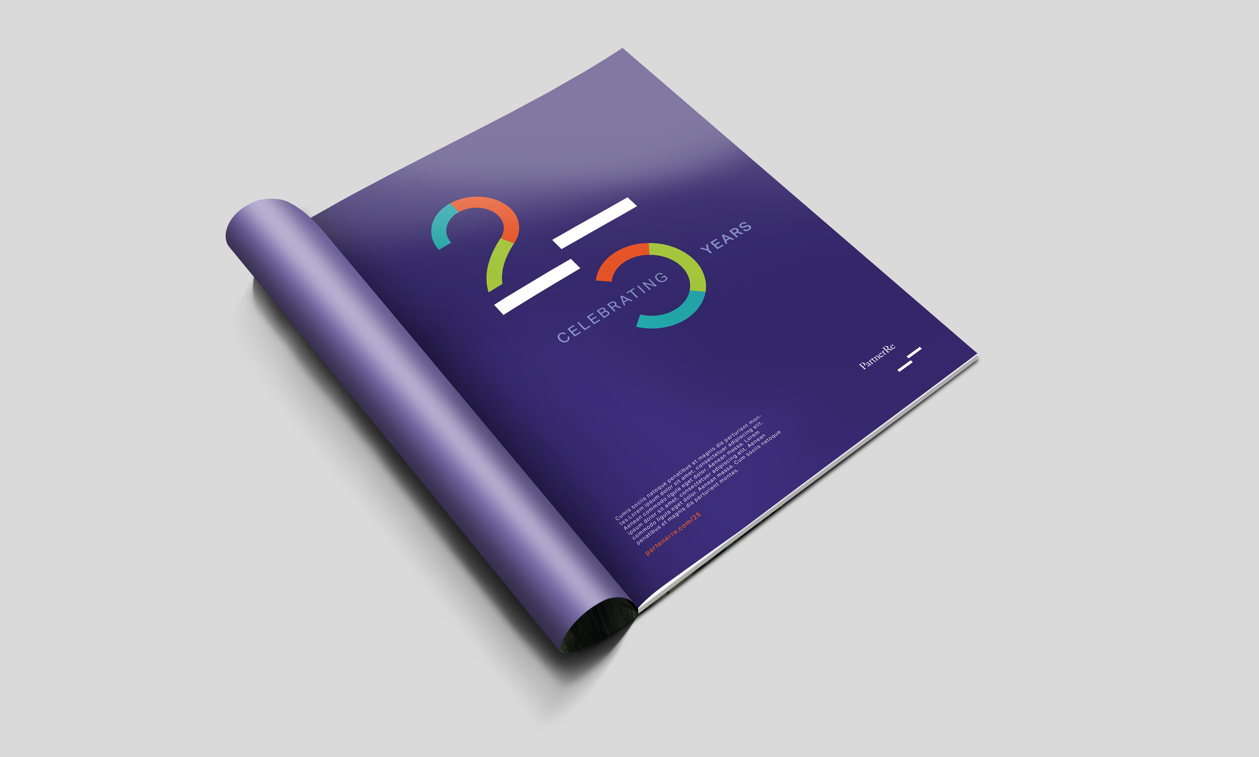
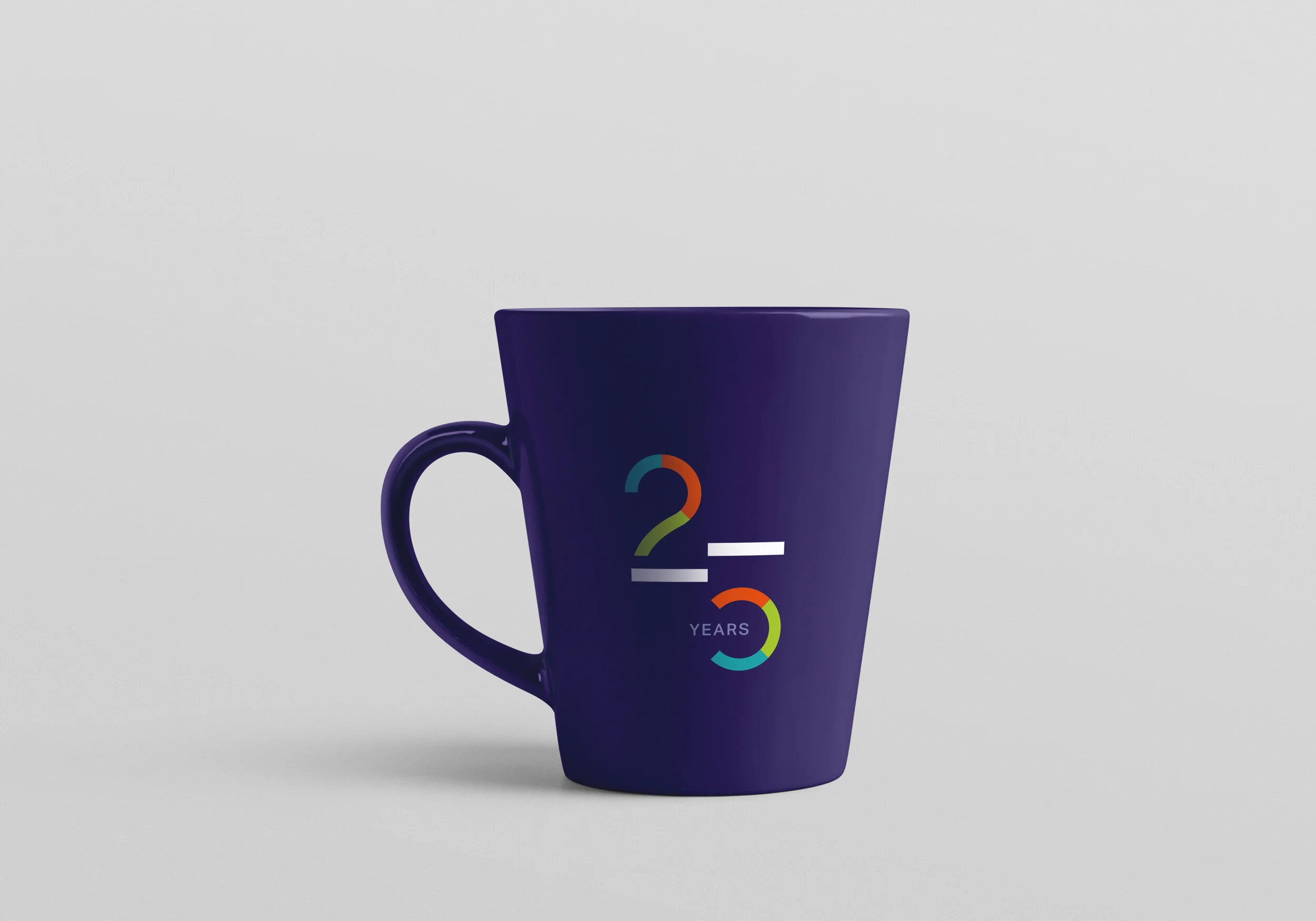
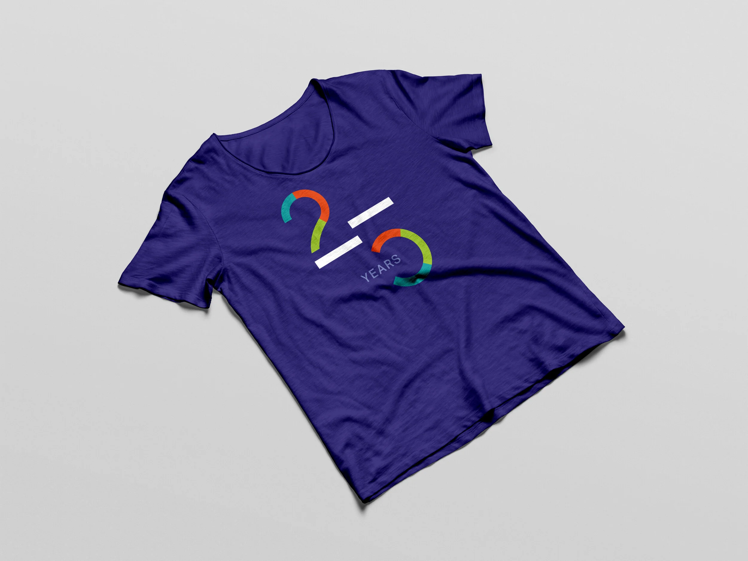
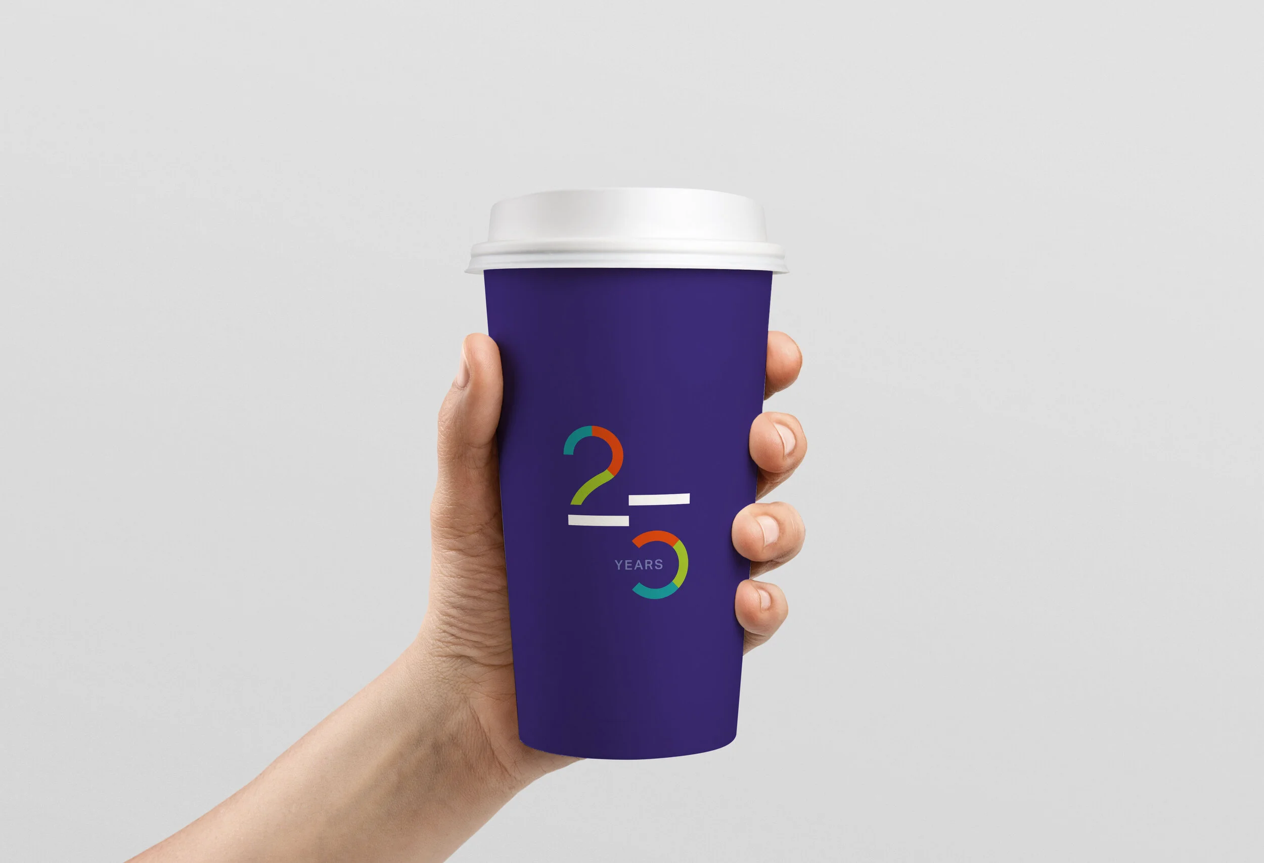
25th anniversary logo
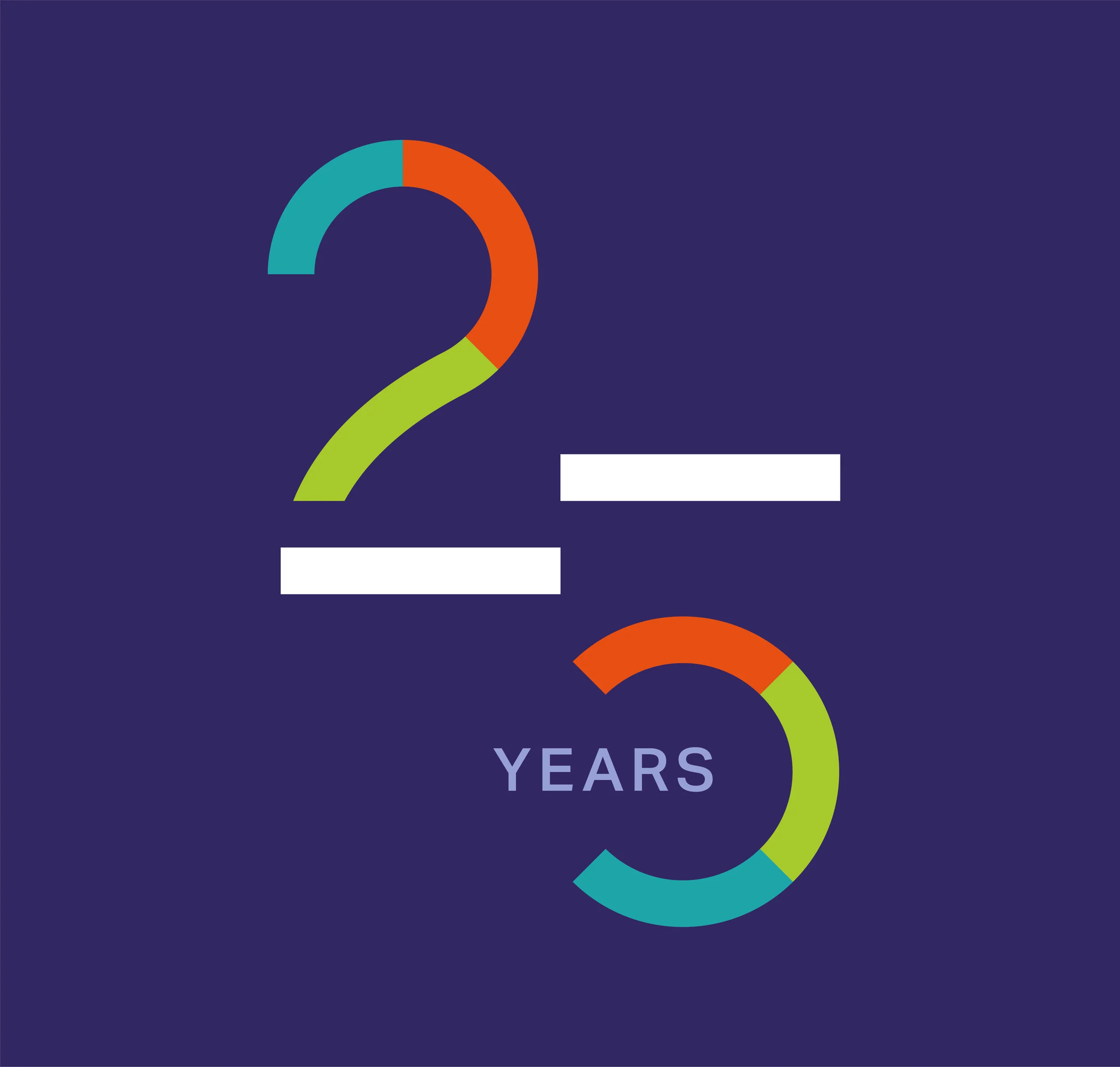
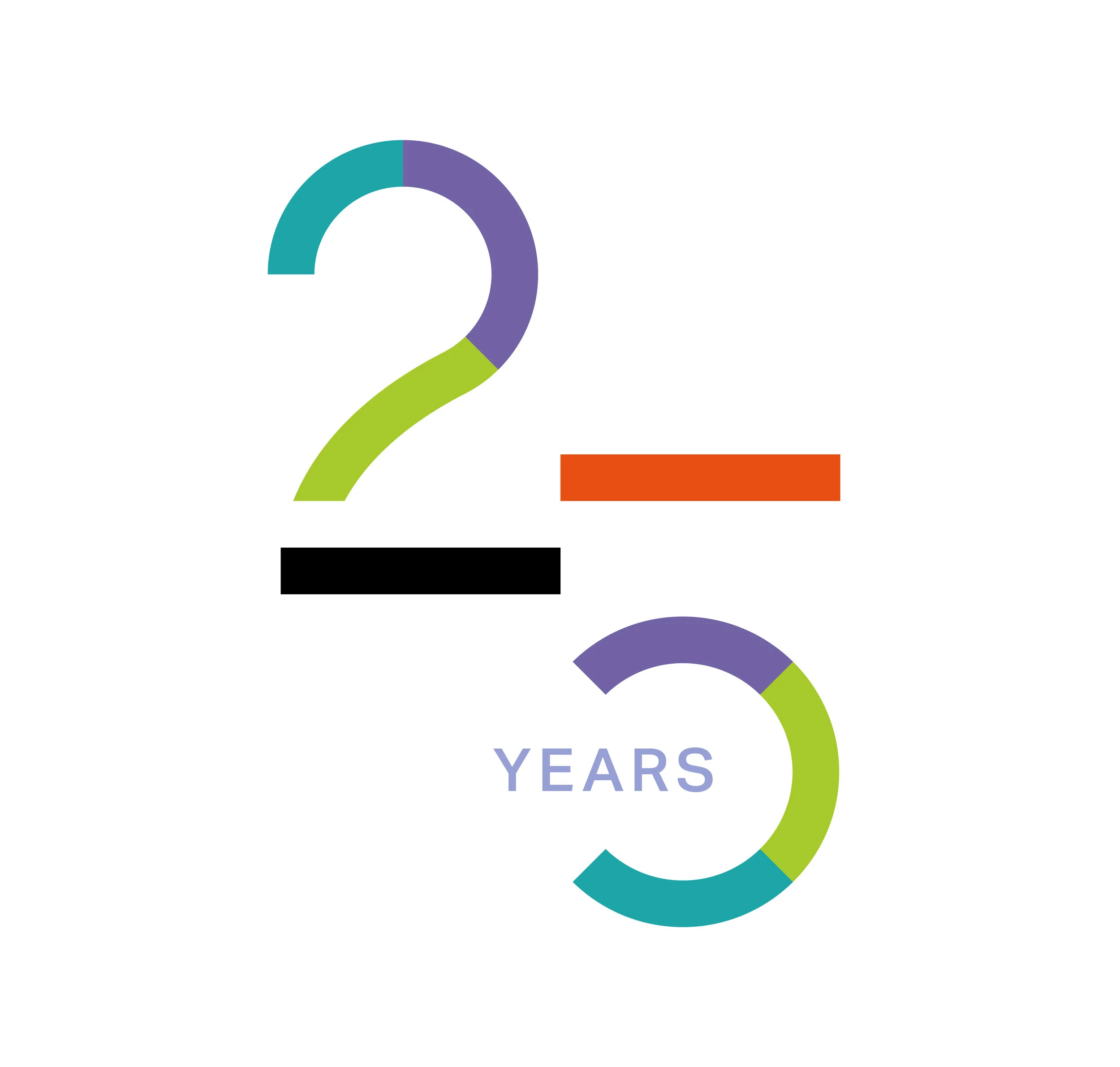
PartnerRe’s 25th anniversary was an opportunity to generate pride and love in the company again, while reinforcing culture and celebrating at the same time.
The objectives for the 25th anniversary recognition and acknowledgment will be largely internally focused in order to: Unify the organization, Retell our story about our past and where we are going, through a new lens, Reinforce culture, Celebrate and have some fun.
E-Magazine
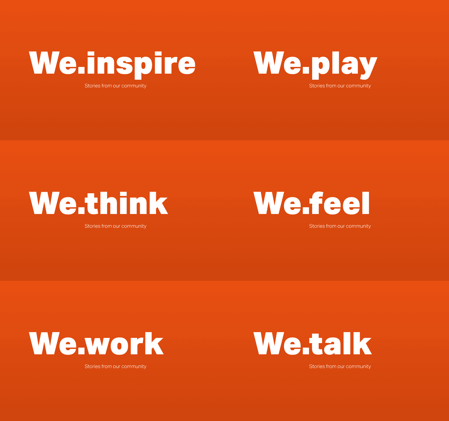
Having the opportunity to work on a monthly e-Magazine for the company it’s been a great opportunity to expand the brand possibilities. Adding the element of motion to the illustrations it’s bringing the brand alive.
Role: Senior Designer
Agency: Agenda
Team: Dan Koh (Creative Director), Dave Rodríguez (Design Director) Juan Davalos (Sr. Designer), Chris Lee (Sr. Designer), Matt Peters (Sr. Designer) Emily Korn (Head of Client Services)

